
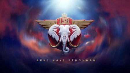
Lucknow Super Giants revealed their new logo for the upcoming 2026 Indian Premier League (IPL) season. The redesigned logo showcases the Garuda, a crown, and an elephant, with the team transitioning from blue to a vibrant red color for a fresh identity. This new emblem bears similarities to the logo of Manchester Super Giants, which also features an elephant in its design.
Manchester Originals underwent a rebranding to become Manchester Super Giants following a 70% acquisition by the Sanjiv Goenka Group. The new logo for the team in The Hundred, unveiled on January 26, highlights an elephant head with red, white, and gold accents. Lucknow Super Giants emphasized that the new logo symbolizes the spirit of the city, the state, and the unwavering support of their fans.
The franchise expressed that the new logo is more than just a design change; it embodies the essence of Lucknow and Uttar Pradesh. The logo integrates three powerful symbols – Garuda, the Crown, and the Elephant – each representing a significant aspect of the region. Owner Shashwat Goenka shared that the logo holds emotional value, reflecting the dreams, pride, strength, and loyalty associated with the team and its supporters.
Shashwat Goenka, owner of Lucknow Super Giants, emphasized the emotional significance of the new logo. He stated that the logo pays tribute to the love and belief shown by the people of Lucknow and Uttar Pradesh towards the team. The symbols in the logo – Garuda, the Crown, and the Elephant – signify the aspirations, pride, and resilience of the region, promising to uphold the city’s values and compete with dedication in the upcoming IPL season.
Lucknow Super Giants have assembled a formidable squad for the upcoming season, led by Rishabh Pant and supported by experienced players like Nicholas Pooran, Mohammed Shami, and Mitchell Marsh. With a fresh logo and a strong team, the franchise aims to clinch their first IPL trophy in the upcoming season.